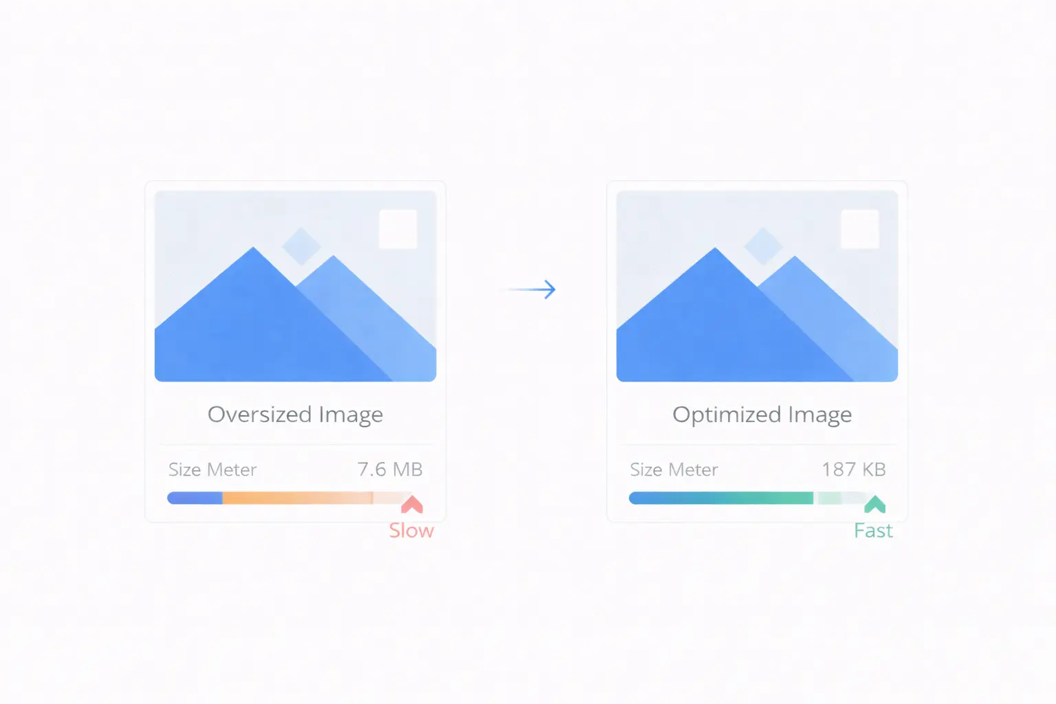
Images are the heaviest assets on most web pages. According to HTTP Archive data, images account for roughly 50% of the total bytes transferred on an average page. A single unoptimized hero image can weigh more than the entire HTML, CSS, and JavaScript combined.
The good news is that image optimization is well-understood, predictable, and can be done without visible quality loss. This guide covers the three key techniques — compression, resizing, and format conversion — and shows how to apply them effectively.
Why Image Optimization Matters
Page Speed
An unoptimized 4 MB hero image takes 3–5 seconds to load on a typical mobile connection. Compress it to 200 KB and it loads in under a second. That difference determines whether a visitor stays or bounces.
Core Web Vitals
Google's Largest Contentful Paint (LCP) metric measures when the main content of a page becomes visible. Since the largest element is often an image, unoptimized images directly hurt your LCP score — and by extension, your search rankings.
Bandwidth Costs
Every byte served costs money. A site serving 100,000 page views per month with 3 MB of unoptimized images per page transfers 300 GB monthly. Cut image sizes by 70% and that drops to 90 GB. The cost savings on CDN and hosting are substantial.
User Experience
Slow-loading images cause layout shifts as they render, frustrating users and hurting your Cumulative Layout Shift (CLS) score. Optimized images load predictably and render smoothly.
The Three Pillars of Image Optimization
1. Compression — Reduce File Size
Image compression reduces the number of bytes in a file by removing data that is either redundant or imperceptible to the human eye.
Lossy compression removes some image data permanently. At moderate quality settings (75–85%), the visual difference is nearly undetectable, but the file size drops dramatically.
Lossless compression reorganizes the data more efficiently without removing anything. The file gets smaller, but not as small as lossy compression.
How much can you save?
| Original Size | After Compression (80% quality) | Savings |
|---|---|---|
| 2.5 MB | 350 KB | 86% |
| 1.2 MB | 180 KB | 85% |
| 800 KB | 120 KB | 85% |
These are realistic numbers for photographic content. Graphics and illustrations with flat colors compress even more aggressively.
The Image Compressor on ToolByte lets you upload images and compress them with customizable quality presets. You can control the balance between file size and visual quality.
2. Resizing — Serve the Right Dimensions
One of the most common mistakes is serving a 4000x3000 pixel image from a camera when the page only displays it at 800x600 pixels. The browser downloads the full image and then scales it down, wasting bandwidth and memory.
The rule is simple: resize images to the largest dimensions they will be displayed at, accounting for high-DPI screens. For a 400px wide container on a standard screen, serve an 800px wide image (2x for retina). Anything larger is wasted.
Resizing considerations:
- Hero images: 1600–2400px wide covers most desktop screens at 2x
- Blog post images: 800–1200px wide is typically sufficient
- Thumbnails: 300–600px wide depending on layout
- Avatars and icons: 100–200px, or use SVG for icons
The Image Resizer on ToolByte supports professional resizing algorithms including Lanczos, Bicubic, and Bilinear interpolation. Lanczos produces the sharpest results for downscaling, making it ideal for web images.
3. Format Conversion — Choose the Right Format
Serving images in the right format can cut file sizes by 25–50% with no quality loss. Here is when to use each format:
WebP — The default choice for web images in 2026. Supported by all modern browsers. Produces files 25–35% smaller than equivalent JPG at the same visual quality. Supports both lossy and lossless compression, plus transparency.
AVIF — The newest format, offering even better compression than WebP (typically 30–50% smaller than JPG). Browser support has improved significantly but is not as universal as WebP. Use it when you can provide fallbacks.
JPG — Still the fallback standard for photographic content. Universal support. Use for older browser compatibility.
PNG — Use for images that require transparency and sharp edges (logos, icons, screenshots with text). Not ideal for photographs due to large file sizes.
SVG — Use for icons, logos, and illustrations. Scales perfectly at any size with tiny file sizes. Not suitable for photographs.
The Image Converter on ToolByte supports conversion between PNG, JPG, WebP, GIF, BMP, TIFF, ICO, and AVIF formats. Converting your existing JPG images to WebP is one of the quickest wins for page speed.
A Practical Optimization Workflow
Here is a step-by-step process for optimizing images before deploying them to your website:
Step 1: Resize First
Start by resizing the image to the appropriate dimensions. This has the biggest impact on file size. A 4000x3000 pixel photo becomes a 1200x900 image, cutting the pixel count (and raw data) by over 90%.
Step 2: Choose the Right Format
If the image is a photograph, convert to WebP. If it is a screenshot with text, PNG or WebP lossless. If it is a logo or icon, use SVG.
Step 3: Compress
Apply compression at 75–85% quality for lossy formats. Compare the original and compressed versions at the display size — you should see no meaningful difference.
Step 4: Test at Display Size
Always evaluate the final image at the size it will be displayed, not zoomed to 100%. Compression artifacts that are visible at full zoom are invisible at 400px display width.
Responsive Images with srcset
Optimizing images is not just about producing smaller files. You also need to serve the right file to the right device:
<img
  src="hero-800.webp"
  srcset="hero-400.webp 400w,
          hero-800.webp 800w,
          hero-1200.webp 1200w,
          hero-1600.webp 1600w"
  sizes="(max-width: 600px) 100vw,
         (max-width: 1200px) 50vw,
         800px"
  alt="Product showcase"
  width="800"
  height="600"
  loading="lazy"
>
This approach serves a 400px image on phones and a 1600px image on large desktop screens, with the browser choosing the best option automatically.
Lazy Loading
For images below the fold, add loading="lazy" to defer loading until the user scrolls near them:
<img src="feature.webp" alt="Feature description" loading="lazy" width="600" height="400">
This reduces initial page load time significantly on image-heavy pages.
Measuring Image Optimization Impact
After optimizing your images, verify the results:
- Google PageSpeed Insights — Check the "Serve images in next-gen formats" and "Properly size images" audits
- Chrome DevTools Network tab — Filter by images and sort by size to find any remaining large files
- WebPageTest — Waterfall view shows exactly how long each image takes to load
- Lighthouse — Provides specific savings estimates for each unoptimized image
Common Mistakes
-
Optimizing for desktop only — Mobile users on cellular connections need smaller images. Use responsive images.
-
Over-compressing — Going below 60% quality usually creates visible artifacts. Stay in the 75–85% range for a safe balance.
-
Ignoring format conversion — Serving JPG when WebP is universally supported is leaving easy performance gains on the table.
-
Skipping the
widthandheightattributes — These attributes prevent layout shifts (CLS). Always include them. -
Not using lazy loading — Loading all images upfront wastes bandwidth for content the user may never scroll to.
Conclusion
Image optimization is not optional for a fast website — it is essential. The combination of resizing to appropriate dimensions, converting to modern formats like WebP, and compressing to reduce file size can cut image weight by 80% or more without any visible quality loss.
ToolByte provides all three essential image tools — Image Compressor, Image Resizer, and Image Converter — for free. Process your images before uploading them to your site, and your users, your search rankings, and your hosting bill will all thank you.
For the complete suite of developer and productivity tools, visit ToolByte by Duo Dev Technologies.
Category: Tools
Tags: image optimization, image compression, image resizer, WebP conversion, image converter, website performance, Core Web Vitals, web development, page speed